Where We've Been Informs Where We're Going: How Site Visits Inspire Design
By Greg Bryla
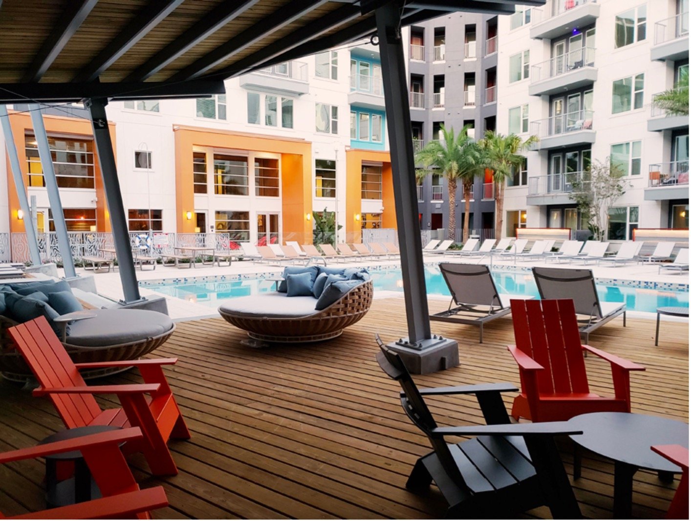
Pool canopy embodies the vibe of the site’s former lumberyard life
Every bit of land has a story –– the land existed long before the rise of civilization and its subsequent development. Whether a landscape design project is of the greenfield or infill variety, there's a story to discover in its site and context. Our goal as landscape architects is to authentically connect future residents and guests to this story so that they may learn more about where they are in this place and time, honoring the past and hopefully carrying new outlooks and insights with them to new places.
To continue writing this story, we must first uncover the story that has already been written, and a site visit is a vital step in the discovery process. Web-based research preps the team for the context and cues during days and weeks spent crawling around the site, taking pictures, noodling on sketches, gathering relics, and essentially being a sponge –– soaking in all the sensory input as potential design drivers.
Parker Lumber: A Case Study
This particular landscape design case study is an urban infill location in Maitland, Florida. It was once home to a sawmill, founded on the site in 1934 and later expanded into Parker Lumber, a building supply company. It was the Home Depot of its day, providing the lumber and building materials that helped create thousands of homes in Maitland over the years.
After nearly 80 years in operation, the owners chose to sell the site due to declining sales and no apparent heir to carry on the family business. The site is immediately adjacent to the CSX railway and, with the opening of the new SunRail commuter train, was purchased by our client for a transit-oriented development: a four-story multi-family wrapping a four-story parking garage and pedestrian connection to the adjacent SunRail station.
With an initial architectural site plan in hand, we headed to the site to experience it for ourselves. We were fortunate that the existing buildings were still intact complete with the sawdust, partial inventory, wood barns, and storage buildings. Having grown up in my family's residential construction business and spent childhood weekends frequenting lumberyards to pick out wood (my Pop was ex-military and very particular!) and other building supplies, stepping onto this site brought back a flood of memories. We documented the buildings and the site's edge conditions with my preference of focusing on the details specific to a lumberyard: the different types of wood grain, wood sizes, metal structures, and a smattering of odd objects.
Original wood bin sorting labels
I still use a lesson from a college lecture that the esteemed Richard Haag gave us. He encouraged us to collect a small relic from the sites to keep on your desk as a reminder of said visit. For the Parker Lumber landscape design project, I was allowed to collect bin labels –– a fond memory from my youth –– which are still proudly displayed on my desk five years later.
Tethering the Past to the Present
The project’s canopy forms were inspired by the original wood barn structure
One object from the original site, a "butler building" resembling a two-story Tinkertoy structure, acted as a relic for our eventual design. During the functional diagram phase of amenity design, we envisioned two large structures for resident gatherings: one in the entry court and the other in the pool courtyard.
With the memories from the site visit still fresh, we began the design process using elements and motifs of the building industry. As you can see in the images, we created two large pavilions for community gatherings: one at the pool and one in the arrival court. The latter is used for cookouts, movie nights, and games, while the former provides shelter from the sun while relaxing poolside while adding a sense of scale to the parking garage. The existing metal structures are clear-coated, leaving their distinct markings intact, highlighting their authenticity and contrasting with newly painted metal components –– calling attention to the site's historical context in the mind of the residents. The project’s new owners have made the design concept an integral part of their lease tour.
Original warehouse metal structure repurposed as amenity canopies
Tethering Parker Lumber's history to its reimagined present required some creativity, with our team using woodgrain, laser-cut metal for the pool barrier and "push/pull" CMU privacy walls with custom-angle iron lighting fixtures. Some of the more adventurous Dix.Hite staff even painted a large mural on the screen wall of the trash enclosure, an unfortunate location in the site plan –– located within the entry court –– yet becoming an opportunity to feature artwork inspired by the wood barns themselves.
Wood bin image inspired mural
With Central Florida welcoming thousands of new residents year after year, our work ensures that these new residents can learn the origins of their current home, taking pride in its execution and identity. None of this would have been possible had we not approached the site visit with an open mind to its offerings and story. As the designers of the reimagined site, we at Dix.Hite are fortunate to be one of the many authors of telling this story.
The interior designers embraced our concept and applied it to the interior amenities


